The Greiner Bio-One eTrack App Dashboard allows for in-depth analysis of laboratory information.
You can define which graphs will be visible for the following areas: Quality, Productivity, Purchasing and Clinical Governance.
Some charts have options such as choosing the type (column, bar, area, pie), defining periods, zooming and printing. In this way, the interpretation of information occurs in a personalized way in each sector.
See below the charts available on the Dashboard.
Chart – Use of materials
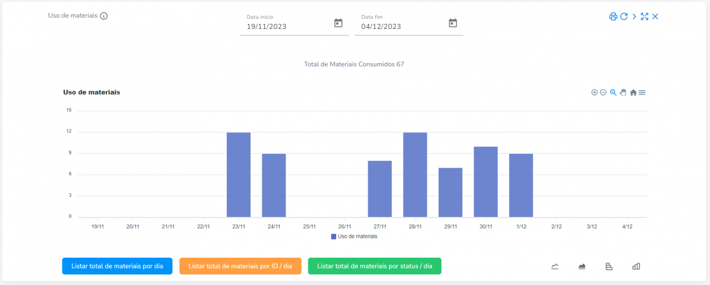
Chart – Use of materials per hour
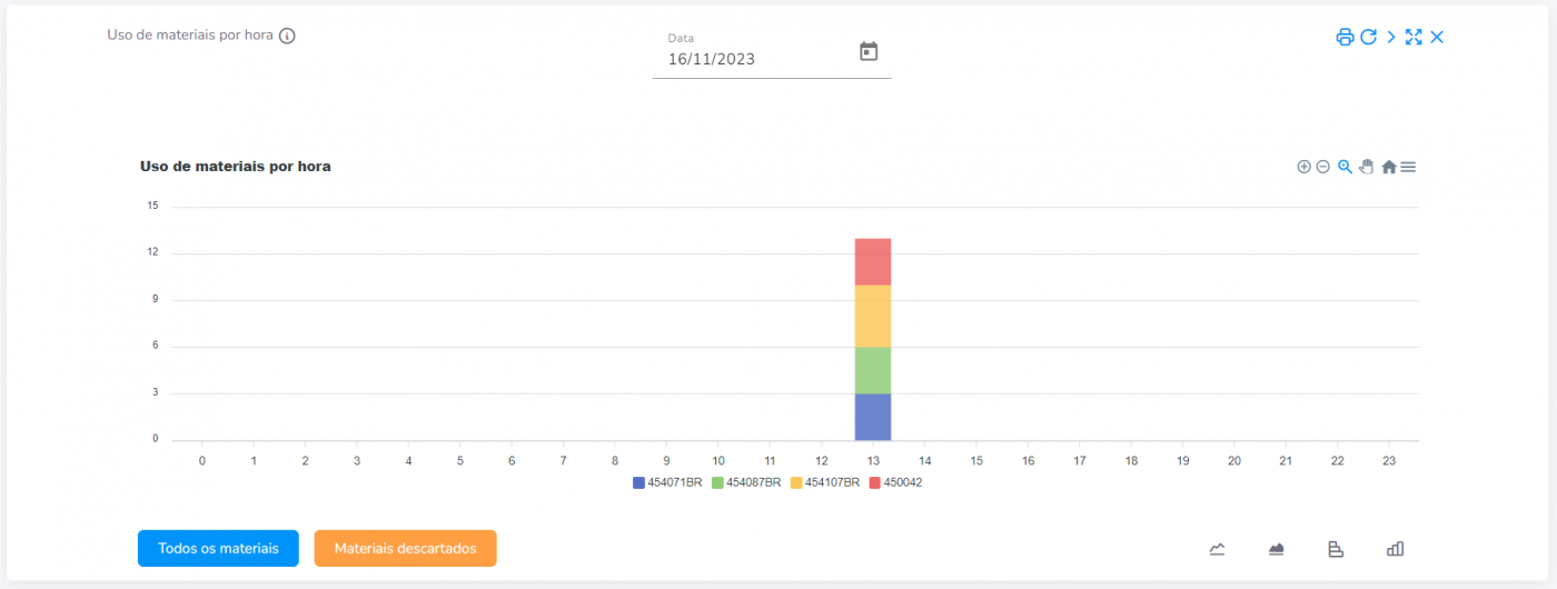
Chart - Attendances by Laboratory
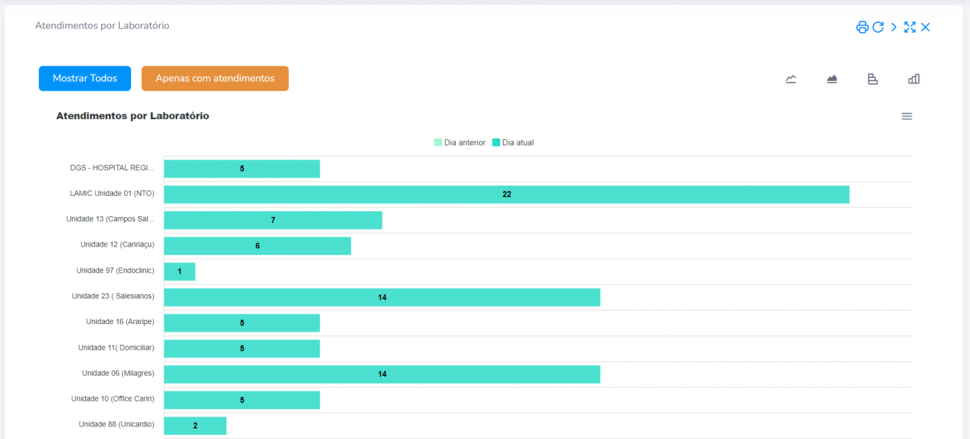
Chart - Materials inventory by ID
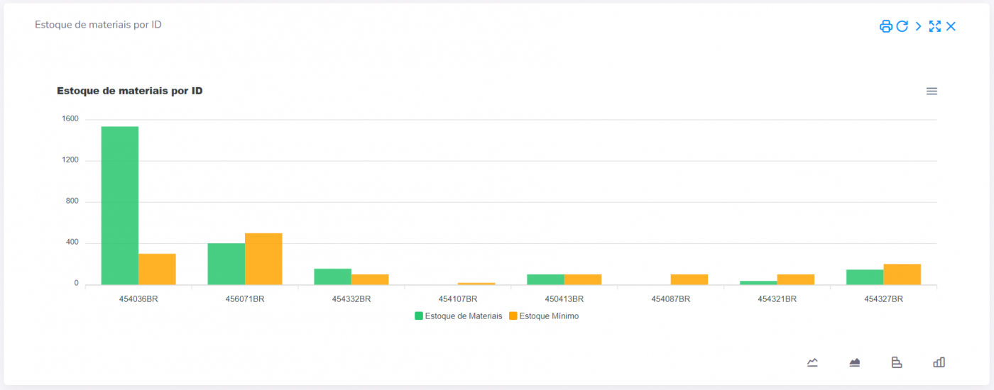
Chart – Average collection time per operator/day
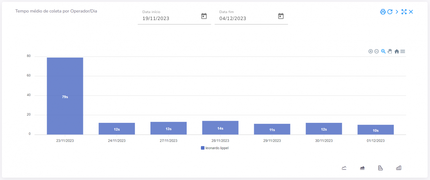
Chart – Average collection time per operator/hour
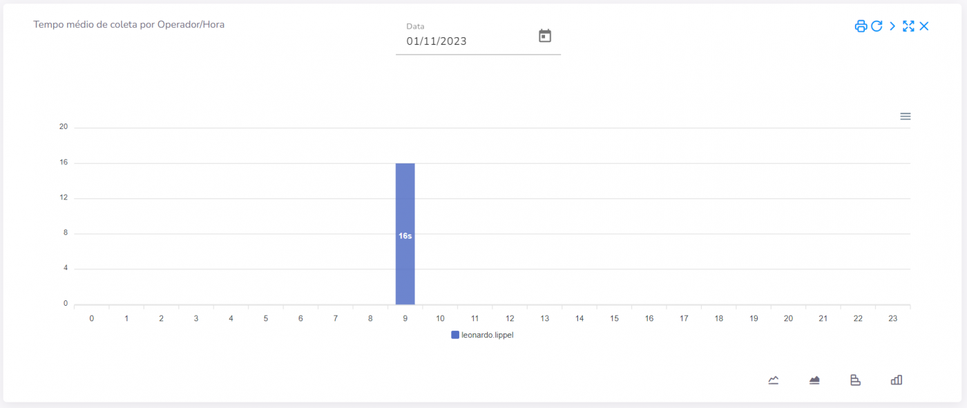
Chart – Average time per patient
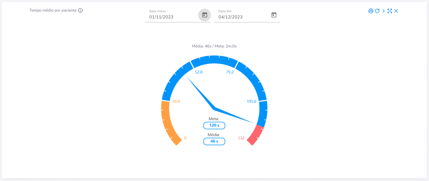
Chart – Consolidated of materials consumed
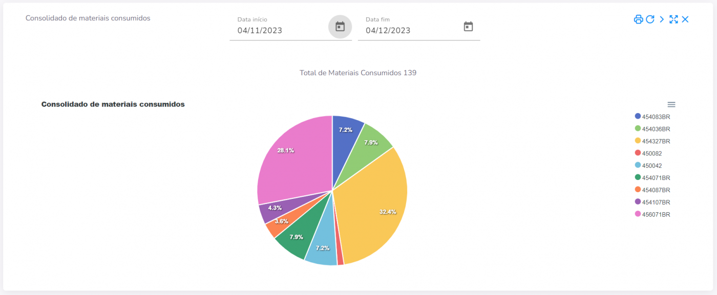
Chart – Satisfaction survey/day
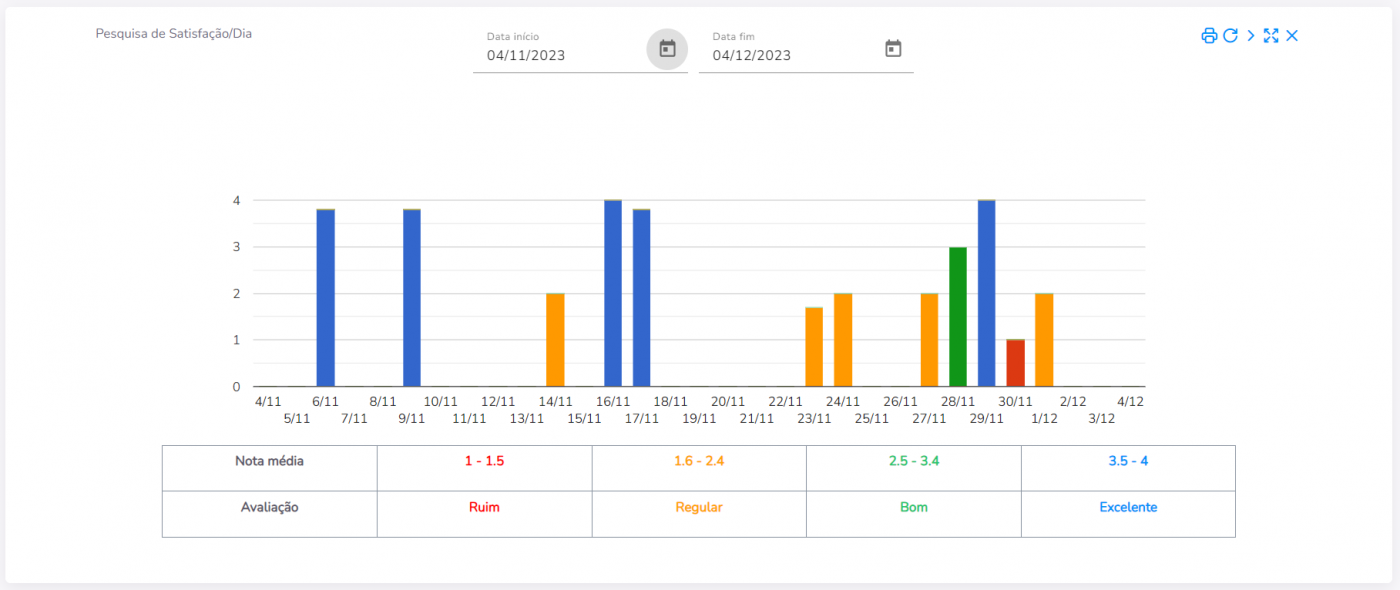
Chart - Overall Efficiency
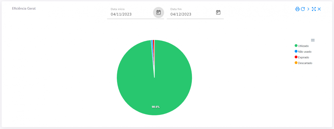
Chart – Efficiency per collector
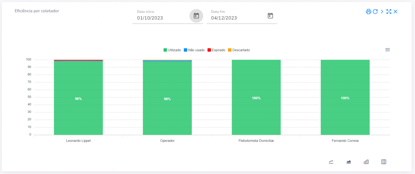
Chart – Productivity
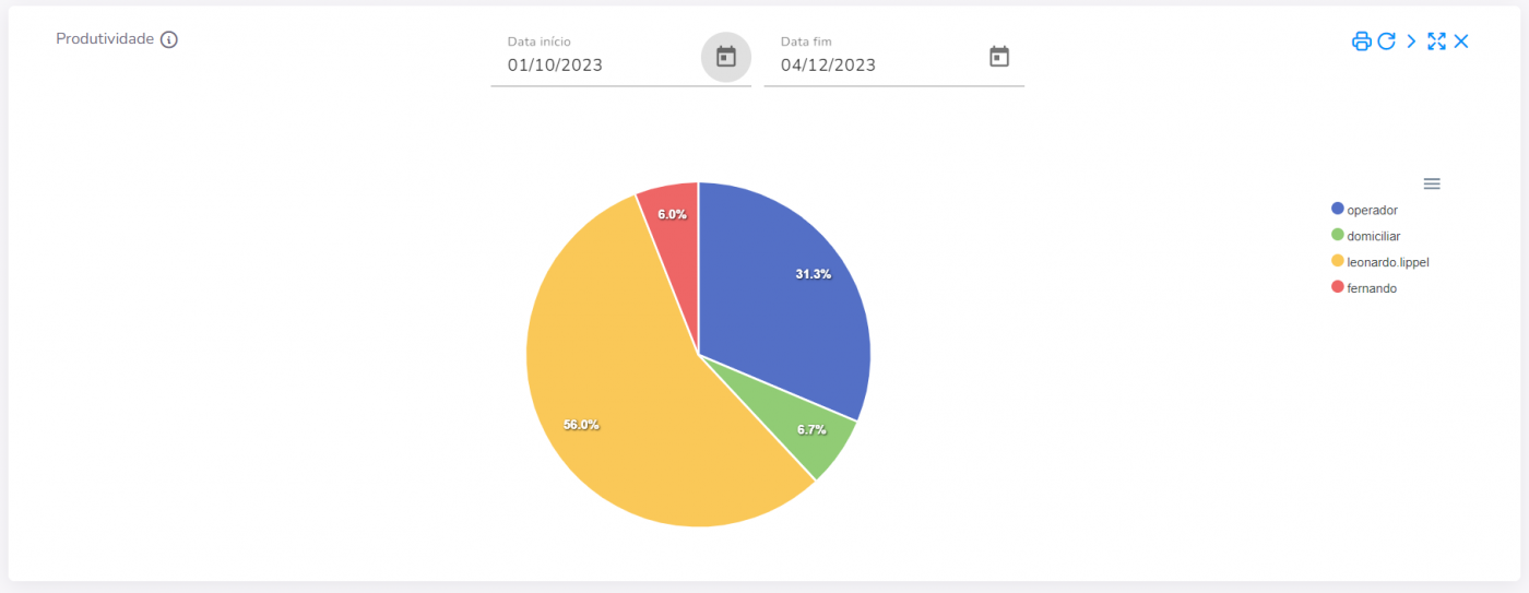
Chart – General customer rating
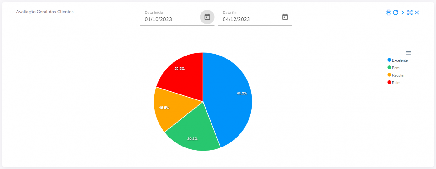
Chart – General customer rating by collector
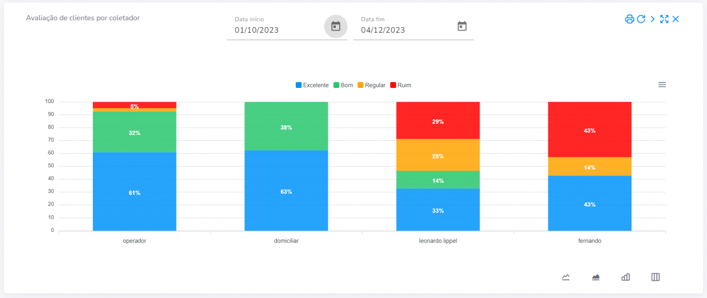
Chart – Number of adverse effects – more details
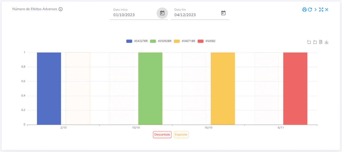
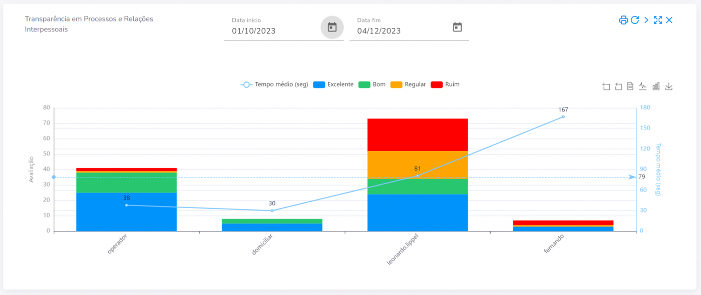
Chart – Transparency in processes and interpersonal relationships – more details
Try our Greiner Bio-One eTrack app right now and find out how it can help your laboratory routine.